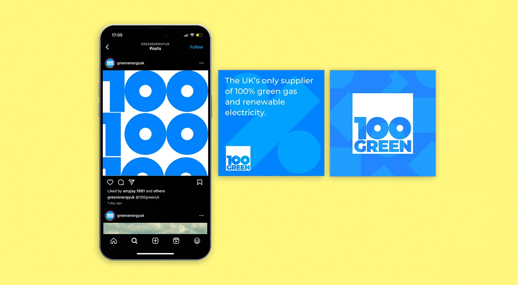
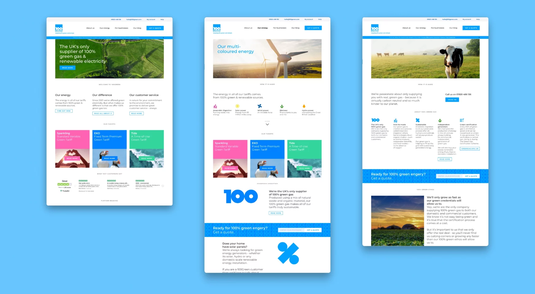
Short on time? We’ll call you.

    Leave your details and we’ll get straight back to you.

    100Green

    Keeping life green and simple.

    Rebranding the UK’s only 100% renewable energy supplier in the spirit of honesty and transparency to create clear and simple distinction amid a complicated sector.

    Insight:

    • The UK energy market was ‘heating up’ through a period of instability.
    • The competitor landscape was becoming increasingly crowded, leading to price volatility and the use of misleading messaging in a desperate bid to grab audience attention.
    • 100Green were celebrating over 20 years of leading the nation’s switch to green energy and had a timely opportunity to highlight what continues to make them unique in the market.

    Idea:

    • Keeping life green and simple
    • Focusing 100Green’s energy on what makes it truly unique within a complex and competitive market – being the only domestic supplier to provide 100% green gas and 100% renewable electricity across the UK; and the only supplier to offer 100% phone-first customer services.
    • Expressing the core values of the company with a focus on honesty, simplicity and commitment to partnering for a better planet.

    Identity:

    • Creation of a new, distinctive brand name that stands out within an over-crowded market and effectively communicates the brand’s differentiation.
    • Development of an ownable positioning – Keeping life green and simple – that helps provide a sense of stability within an unstable marketplace and reaffirms their intent to lead the nation towards a greener, more sustainable future.
    • A bold, bright, fresh visual identity that reflects the brand’s focus on simplicity, coupled with a more positive, honest tone of voice that better communicates the brand’s open and optimistic personality.
    • A suite of animations and icons designed to support the brand’s communications, enables 100Green to be clearer and more accessible for their audiences.
    • The new playful stop-motion brand film, created in collaboration with an animation company committed to being environmentally conscious in their approach, embodies the brand’s personality whilst effectively communicating their green and simple positioning.

    Implementation:

    • Naming
    • Brand strategy & positioning
    • Visual identity
    • Brand communications