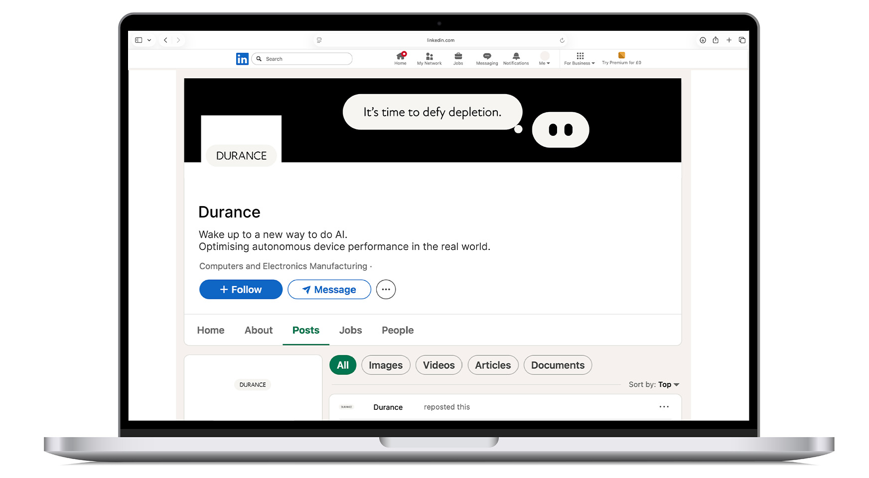
Endurance made easy at the edge – a quietly powerful identity for a new era of durational AI.
Insight:
- We are entering a new age of autonomy, in which autonomous devices need to perceive,
decide and act for longer – without demanding more power or complexity. - Device duration is emerging as the critical metric, shifting focus from peak performance
to real-world behaviour and predictability. - As a deep-tech, brain-inspired hardware company, Durance needed to feel both technically credible and refreshingly human.
Idea:
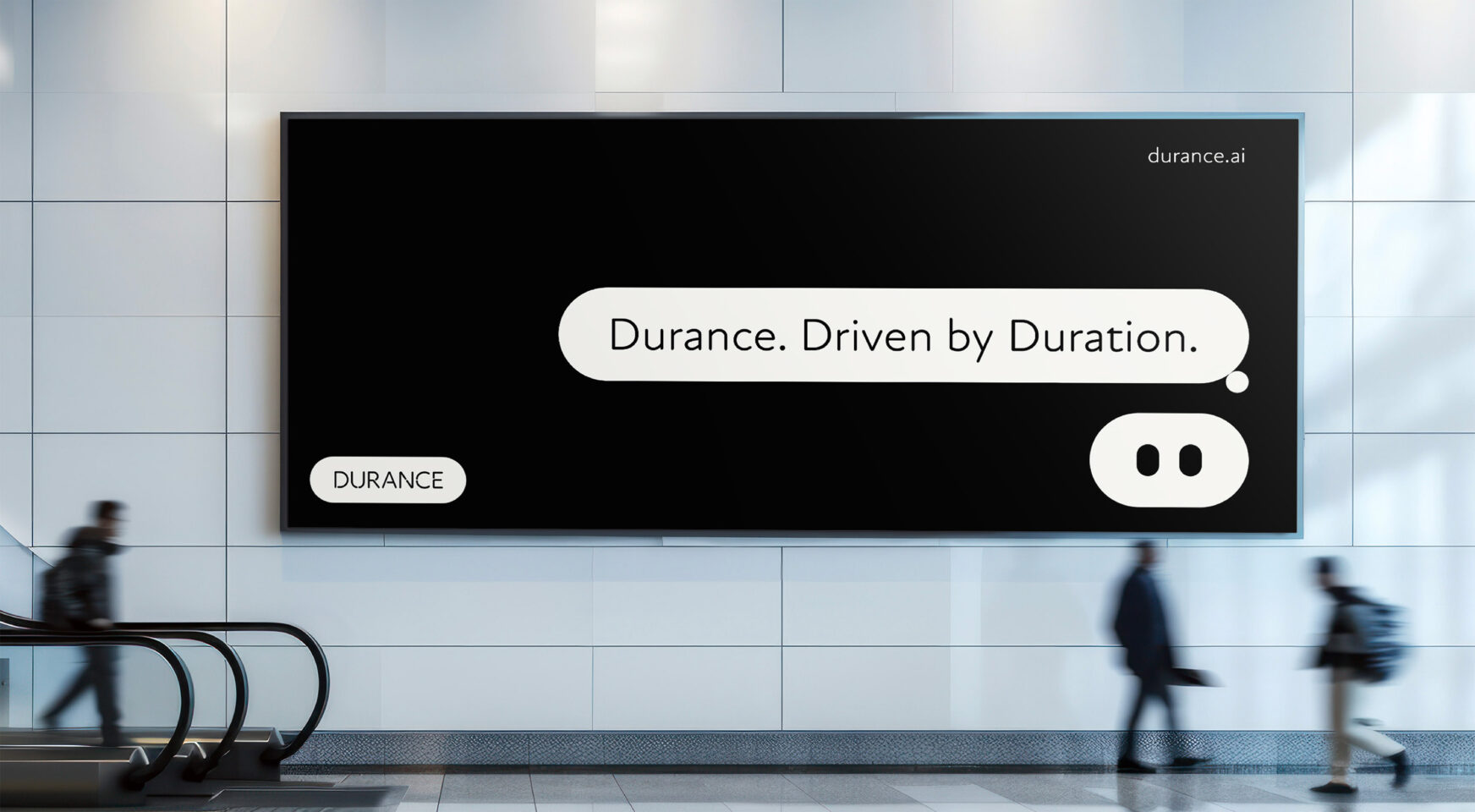
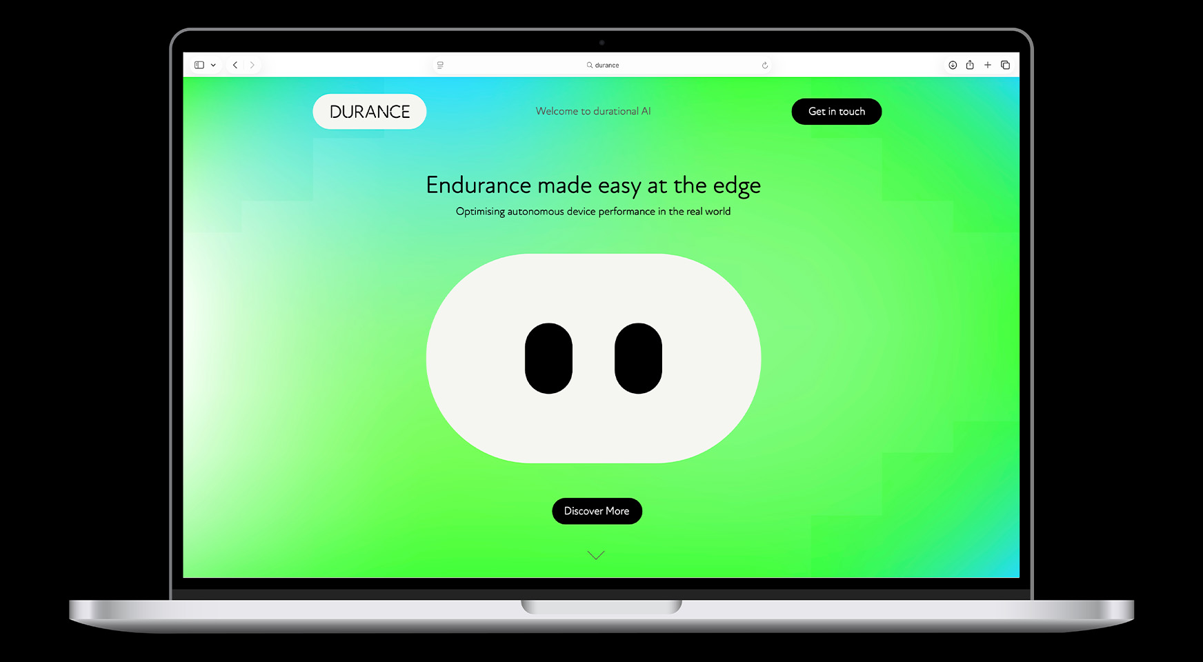
- A clear, compelling proposition: “Endurance made easy at the edge.”
- Positioning Durance as enabling AI that is awake when needed, asleep when not –
efficient, seamless and built for real-world deployment. - Framing the technology around a new Durational Quotient (DQ) metric.
- Creating a brand voice that is calm, measured and quietly confident – leading with ease,
backed by intelligence.
Identity:
- A structured yet softened wordmark, shaped by gentle stencil breaks and inspired by the perpetual flow of the Durance river in France, as a nod to the company’s French origins.
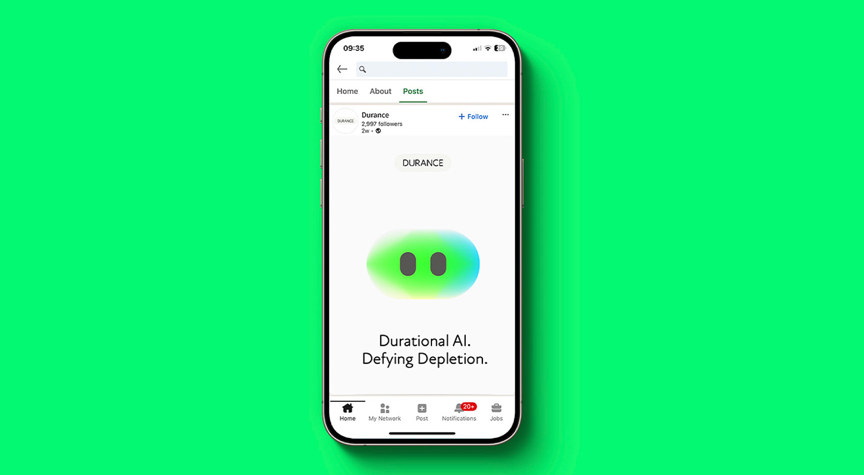
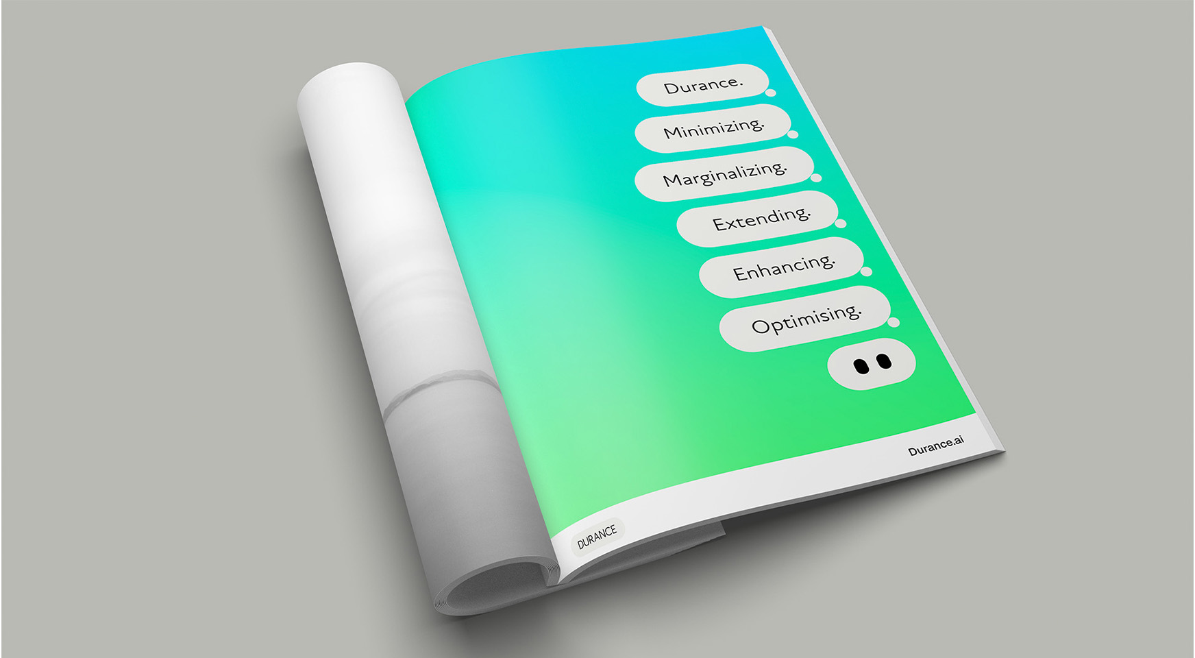
- Eddy – our distinctive robot symbol expressing perception and friendly intelligence.
- A rounded typographic system that mirrors the logo and adds accessibility to the
technical category. - A restrained palette of warm greys with vivid accents signalling “on”, energy and activation.
- A proprietary liquid visual treatment, expressing flow, refraction and enduring motion.
Implementation:
- Naming: brand, hardware and technology stack
- A scalable design system for web, social and product communications –
spacious, uncluttered and contemporary - Motion design and animation
- Brand assets and templates ready for launch and growth